A dog food subscription is rarely just about logistics; it’s a designed narrative you welcome into your home. The box on your doorstep is a physical manifesto, a carefully curated chapter in the story you tell about your pet’s life.
We talk a lot about ingredients and delivery schedules, but we often overlook the silent, powerful language of the package itself. Before your dog ever tastes a single kibble, you have already consumed a wealth of information. The texture of the cardboard, the choice of font, the color of the logo—these aren’t afterthoughts. They are the opening lines of a conversation a brand is having with you about identity, care, and trust. This visual dialogue shapes our entire experience with pet food delivery, turning a routine purchase into a personal statement.
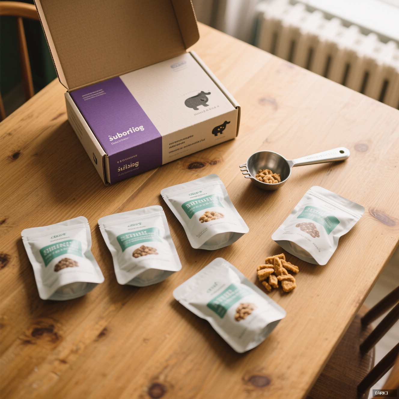
The Unboxing as a Ritual of Trust
Think about the last time a subscription box arrived. The act of opening it likely followed a small, personal script. You brought it inside, maybe used a key to slice the tape, and lifted the lid. This moment is where the brand’s promise is either validated or broken before you even see the product.
Packaging design builds immediate, subconscious trust. A matte-finish box with clean, sans-serif typography whispers “scientific” and “modern.” It feels precise, like something developed in a lab. In contrast, recycled cardboard with hand-drawn illustrations murmurs “artisanal” and “earthy.” It suggests a connection to nature and hands-on craftsmanship. This visual grammar is not accidental. It’s a deliberate signal, assuring you that the contents match the container’s carefully constructed ethos. The unboxing experience itself becomes a ritual of reaffirmation, a tactile promise that you’ve made the right choice for your canine meal plan.
Translating Health Claims into Visual Feeling
What does a brand’s visual language actually say about your dog’s health? Quite a lot, it turns out. In a market saturated with complex terms like “ancestral diet,” “limited ingredient,” and “human-grade,” design acts as a crucial shorthand for nutritional philosophy.
Consider the color palette. Muted greens, soft browns, and creamy beiges, often paired with photographs of whole sweet potatoes or fresh blueberries, project a natural, holistic health narrative. It speaks to owners who prioritize whole foods and a connection to nature. On the other end of the spectrum, bold, clinical blues, crisp whites, and the clean lines of data graphs suggest a tech-forward, precision-nutrition approach. This aesthetic appeals to the data-driven pet parent who wants metrics and science-backed formulas.
The imagery is equally telling. Is the pouch adorned with a photo of a grinning Golden Retriever in a sun-drenched field? That sells joy and vitality. Are there detailed diagrams of a dog’s digestive system? That sells innovation and targeted health. This design language translates abstract health claims into an immediate, emotional feeling. It doesn’t just sell food; it sells a future—a vivid vision of your dog’s peak vitality, rendered in Pantone colors and thoughtful negative space.
Designed for the Digital Kennel: The “Instagrammable” Box
We can’t discuss modern subscription pet supplies without acknowledging the elephant—or rather, the Labrador—in the room: social media. The rise of the “pet influencer” has fundamentally reshaped product design. Many brands now design explicitly for the “shareable moment.”
A box that opens like a treasure chest, revealing individually wrapped pouches nestled in crinkle-cut paper. A sleek, minimalist bag with a single, striking logo against a vibrant, monochrome background. These aren’t happy accidents. They are calculated designs for the flat lay, the unboxing video, the “What my dog eats in a day” reel. This shareability extends the brand’s narrative far beyond your doorstep, directly into your social feed. Your choice of a canine meal plan becomes a public, visual badge of sophisticated, attentive pet parenthood. the product must perform not just in the bowl, but in the grid. It needs to tell your followers a story about you, as much as it tells you a story about your dog’s diet.
The Rhythm of Care: Delivery as Narrative Pacing
The physical box is only one part of the story. The rhythm of its arrival is another powerful narrative tool. The delivery schedule is the pacing of your pet care story.
A standard monthly box is a reliable, steady subplot. It’s a comforting beat in the background of your life, a reminder that you’re on top of things. But the real narrative magic happens with customization. A subscription that automatically adjusts portions as your puppy grows, or seamlessly transitions its formulas from “adult” to “senior” at the right time, feels like a personalized, evolving biography. It acknowledges that your dog’s life has chapters.
Even the automated emails contribute. A subject line that reads “Your next chapter is shipping” or “Rex’s fresh meals are on the way!” frames sustenance as a continuing saga. The profound relief of never facing an empty food bowl before a hectic workday? That’s the resolution of a stress-filled subplot in your life, replaced by the calm of a predictable, well-designed narrative arc. The service solves a logistical problem, but it sells a feeling of effortless mastery.
A Practical Checklist: Reading Between the Design Lines
How can you become a more conscious reader of these design narratives? Next time a box arrives, slow down and engage your senses. Ask yourself these questions:
- Hold the box. Does the material feel premium and sturdy, or flimsy and cheap? The weight and texture are your first tactile clues.
- Read the typography. Is it a sharp, clinical sans-serif? A friendly, rounded font? Or a rustic, script-like typeface? Each style implies a different brand personality.
- Analyze the color scheme. What immediate emotional response does it trigger? Do the colors evoke calm, energy, purity, or something else entirely?
- Observe the imagery. Are you seeing photos of real ingredients, idyllic scenes of happy dogs, or scientific diagrams and icons?
- Document the unboxing. Mentally note the process. Is it a chore to get to the product, or is it a layered, enjoyable experience you’d consider photographing?
- Listen to the language. Read the inserts and marketing emails. Do they use words like “process,” “crafted,” “tailored,” “heritage,” or “innovative”? The vocabulary builds the story’s theme.
A Different Kind of Romance: Pet Food vs. Human Meal Kits
It’s tempting to compare dog food subscription boxes to their human meal-kit counterparts, but the core narrative they sell is fundamentally different. Human meal kits often sell the romance of transformation—the adventurous home chef you could be, the exciting new cuisine you’ll master. They are about your potential.
Pet food delivery, however, sells the romance of validation. It’s about the ideal, caring owner you already are. The narrative isn’t about your transformation; it’s about affirming your existing, profound love for your dog. The design borrows heavily from wellness and tech aesthetics, but filters them through a lens of nurturing rather than self-improvement. It taps directly into a deep-seated, powerful desire: to provide unquestionably good care, and to have that care recognized as thoughtful and modern. The connection is potent because it aligns the product with your emotional identity as a pet parent.
Navigating the Narrative: Common Questions Answered
This focus on design and story naturally leads to some important questions for any consumer.
- Does fancy design mean better food? Not necessarily. It means better-communicated intent. A beautiful box is a promise, but the ingredient list and nutritional adequacy statement are the contract. Always scrutinize what’s behind the beautiful facade.
- I just want the food, not the story. Is that okay? Absolutely. Functionality is paramount. But recognize that you’re still receiving a narrative with every delivery; you’re simply choosing to ignore the subtext and focus on the core utility. There’s nothing wrong with that.
- Can great design distract from a mediocre product? Initially, yes. A stunning unboxing can create a powerful halo effect. But a dog’s health, energy levels, coat condition, and plain old appetite are the ultimate plot twists. No amount of beautiful packaging can hide a product that fails in the bowl over the long term.
- Why do so many premium subscription brands look similar? They converge on a set of visual codes that have been market-tested to signal “premium,” “trustworthy,” and “healthy” to consumers. Minimalist layouts, certain color families, and specific photography styles create a design dialect we’ve all learned to understand. It’s a visual shorthand for a category.
In the end, choosing a dog food subscription is a deeply personal decision. Nutrition, price, and your dog’s specific needs must always come first. But by understanding the powerful language of design and narrative that surrounds these services, you become a more empowered consumer. You can appreciate the artistry of the box on your doorstep while never losing sight of what truly matters: the health and happiness of the dog waiting eagerly beside you to tear into it. The best subscription service understands that its most important story isn’t printed on the package—it’s written in the daily life of your pet.
Sources & Further Reading
- Brand New: Opinion on Corporate Brand Identity – For analysis of how visual identity changes communicate new brand stories.
- The Psychology of Design & Brand Loyalty – Explores how specific design choices influence consumer behavior and emotional connection.
- Packaging Digest – An industry publication offering insights into packaging trends, materials, and technology.
- AIGA Design Resources – Professional guides on fundamental design principles, ethics, and practices.
✨ You Might Also Enjoy


You may also like
Herbal Bead Bracelet: Ancient Chinese Aromatherapy for Modern Wellness | HandMyth™
Original price was: ¥2,199.00.¥1,352.00Current price is: ¥1,352.00. Add to cartPremium Herbal Beads Bracelet: Traditional Medicine Meets Modern Jewelry | Shop HandMyth
Original price was: ¥874.00.¥608.00Current price is: ¥608.00. Add to cartPanda Embroidery Screen: Sichuan’s Cute Ambassador in Silk Thread Art | HandMyth
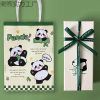
Original price was: ¥319.00.¥230.00Current price is: ¥230.00. Add to cartPanda Gift Set: Curated Chinese Treasures for Panda Lovers | HandMyth™ (Free Gift Wrap)
Original price was: ¥136.00.¥118.00Current price is: ¥118.00. Add to cartTibetan Thangka Storage Box: Sacred Art Protection for Collectors | HandMyth
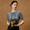
Original price was: ¥280.00.¥219.00Current price is: ¥219.00. Add to cartPure Silk Handbag: Hangzhou’s Legendary Silk Weaving for Modern Elegance | HandMyth™
Original price was: ¥874.00.¥786.00Current price is: ¥786.00. Add to cartHand-Painted Silk Scarf: Wearable Art from China’s Silk Road | HandMyth (Artist Signed)
Original price was: ¥1,017.00.¥935.00Current price is: ¥935.00. Add to cartModern Qipao Dress: Timeless Chinese Elegance for Today’s Woman | HandMyth (Custom Fit)
Original price was: ¥2,459.00.¥2,240.00Current price is: ¥2,240.00. Add to cartEmbroidered Chinese Handbag: Suzhou Silk Embroidery Meets Modern Fashion | HandMyth™
Original price was: ¥680.00.¥646.00Current price is: ¥646.00. Add to cart