Mythical bird feather art is more than a fleeting trend in fantasy illustration. It is a profound, symbolic design language waiting to be translated into compelling visual systems. When you see a phoenix plume or a roc’s quill, you’re not just seeing decoration. You’re encountering a pre-built story of rebirth, rarity, or impossible flight. The real magic happens when that story is harnessed with discipline, moving beyond a pretty picture to become the very architecture of a brand’s world.
From Ornament to Architecture: The Feather as a Design System
Think of a feather. Not as a static icon, but as a living kit of parts. Its central shaft, the rachis, is a line of purpose. The branching barbs create rhythm and texture. The gradient of color tells a story from base to tip. This is your design system in embryonic form.
A brand can let the rachis’s clean strength dictate its primary typeface. The gentle curve of a barb can become the standard radius for every button and card. That ombre shift from deep crimson to gold? That’s your gradient palette, applied to backgrounds, overlays, and interactive states. Suddenly, every element feels connected. It feels like it grew from the same source, even when the literal feather is nowhere in sight. This creates a subconscious cohesion that feels inherent, not applied. You’re not using a feather; you’re speaking its language.
The Silent Story: Why Fantasy Plumage Captivates
Scroll through any social feed. What makes you stop? Often, it’s an image that bypasses logic and speaks directly to a shared emotional vocabulary. A meticulously rendered, glowing feather does exactly that. It doesn’t need a caption explaining “transformation” or “luxury.” It is those concepts, made visual.
This visual shorthand is potent in our fragmented attention economy. The style can swing between two equally powerful poles: maximalist, intricate detail that invites deep, admiring focus, or stark, symbolic minimalism that communicates purity and power in an instant. Both are highly shareable because they offer an immediate emotional or aspirational pull. They are silent stories that spread because we understand their meaning intuitively. We want to touch that magic, to be associated with that sense of wonder.
Where Legendary Illustrations Fall Flat: The Souvenir Problem
So why does this powerful symbolism often fail in practice? The culprit is usually a literal, one-off approach. Plopping a highly detailed griffin feather onto a website header as mere ornament is like nailing a beautiful, exotic souvenir to your wall. It’s interesting, but it feels separate. It creates dissonance.
The feather becomes an isolated artifact, not the foundational dialect of the brand’s world. It looks imported, not inherent. Without a systematic thread connecting it to typography, spacing, color, and materiality, the powerful symbol degrades into decorative noise. It weakens the narrative it was meant to strengthen because it stands alone, shouting its symbolism in a room where nothing else speaks its language.
Building a Universe from a Single Motif
Can one feather truly build an entire brand world? The most compelling visual identities prove it can. The key is to treat the feather not as an image, but as an origin story—a first principle from which all else evolves.
Its structure dictates motion. An animation might flow from the sturdy base to the delicate, trailing tip, mimicking growth or release. Its material suggests tangible textures: the iridescent sheen of a hummingbird, the soft resilience of an owl’s plume, the sharp, metallic quality of a thunderbird’s quill. These inform packaging materials, textile choices, environmental surfaces.
Think further. What does a feather sound like? The soft rustle of barbs against each other could inform an audio logo or sonic branding palette. This holistic approach transforms a fantasy plumage creation from a simple asset into a generative architecture. It builds an immersive universe that feels discovered and authentic, not arbitrarily invented. Every touchpoint feels like it’s made from the same mythical material.
Your Practical Toolkit: Evaluating Feather Art for Your Brand
Before you commit to a mythical quill, put it through this rigorous process. This turns inspiration into a actionable framework.
- Deconstruct with Intent: Don’t just look—analyze. List the 3-5 core visual attributes of your chosen feather. Is it the razor-straight rachis? The chaotic, overlapping barbs? A specific, three-step color transition?
- Map to Fundamentals: Force a connection. Can each attribute directly inform a concrete design decision? If the barb has a soft curve, that becomes your border-radius standard. If the vane has a repeating pattern, that could dictate your layout grid or background texture scale.
- The Abstraction Test: This is critical. Hide the literal feather image. Does the visual system—the colors, curves, lines, and rhythms—still feel cohesive and evocative on its own? If it collapses, the system isn’t strong enough.
- The Material Audit: Scrutinize every touchpoint. From the mobile app UI to the business card stock to the interior of a retail space, do they all feel like they are crafted from the same essence? Does the “texture” of the brand feel consistent?
- The Narrative Alignment Check: This is the soul of the project. Does the myth of your chosen bird align authentically with your brand’s core actions? A phoenix symbolizes rebirth—perfect for a recovery app or a recycled materials company. A Simurgh feather, representing healing and connection, might suit a telehealth platform. A literal mismatch creates cognitive dissonance.
Navigating Common Questions & Concerns
It’s natural to have reservations when blending myth with commerce. Let’s address them head-on.
- “Isn’t this too ‘fantasy’ for a serious brand?” Only if you let it be. The power lies in abstraction. You are leveraging the universal principles—resilience, interlocking structure, graceful asymmetry—not the genre. Think of it as biomimicry for brand identity. No one thinks Apple is a “fruit company.”
- “How do we avoid clichés like the ubiquitous phoenix?” The world of ornithological myth is vast. Dive deeper. A Simurgh feather (from Persian myth) implies ancient wisdom, healing, and the connection of all living things. A Thunderbird quill (from Indigenous North American traditions) speaks to raw power, storms, and protection. A Caladrius (from Roman legend) is a bird that takes sickness into itself and flies away with it, a potent symbol for healthcare. Specificity always beats generality. The research itself becomes a rich part of your brand story.
- “Can this work for a digital-only brand?” It’s arguably more powerful there. A digital interface inherently lacks physical texture. A strong, systematic visual language rooted in a tactile, organic form like a feather can provide that missing sense of crafted materiality. It makes the pixels feel tangible, giving users a subconscious sense of quality and care.
Sources & Pathways for Deeper Exploration
Grounding your mythical explorations in real-world knowledge makes the resulting design language richer and more credible.
- Smithsonian Magazine: The Science of Bird Feathers – Understanding the astonishing biological engineering of real feathers provides a boundless well of inspiration for structure, pattern, and function.
- Encyclopedia Britannica: Phoenix Mythology – A reliable starting point for tracing the evolution of one symbol across cultures, from ancient Egypt to Greece and beyond.
- AIGA Design Archives – An invaluable resource for studying how master designers have systematized symbolic motifs and built enduring visual languages throughout history.
- Cornell Lab of Ornithology: Handbook of Bird Biology – For the truly dedicated, this deep dive into avian morphology offers endless formal ideas for color, pattern, and form that can be abstracted into design principles.

The process of mythical bird feather art from a niche illustration style to a core design philosophy is one of translation. It asks you to listen to the story already held within the form and to write that story anew in every color, curve, and interaction. When done with respect and rigor, it doesn’t just make a brand look distinctive. It makes it feel legendary.
✨ You Might Also Enjoy
You may also like
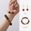
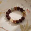
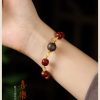
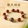
Herbal Bead Bracelet: Ancient Chinese Aromatherapy for Modern Wellness | HandMyth™
Original price was: ¥2,202.00.¥1,354.00Current price is: ¥1,354.00. Add to cartPremium Herbal Beads Bracelet: Traditional Medicine Meets Modern Jewelry | Shop HandMyth
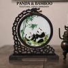
Original price was: ¥876.00.¥609.00Current price is: ¥609.00. Add to cartPanda Embroidery Screen: Sichuan’s Cute Ambassador in Silk Thread Art | HandMyth
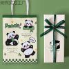
Original price was: ¥320.00.¥231.00Current price is: ¥231.00. Add to cartPanda Gift Set: Curated Chinese Treasures for Panda Lovers | HandMyth™ (Free Gift Wrap)
Original price was: ¥136.00.¥118.00Current price is: ¥118.00. Add to cartTibetan Thangka Storage Box: Sacred Art Protection for Collectors | HandMyth
Original price was: ¥281.00.¥219.00Current price is: ¥219.00. Add to cartPure Silk Handbag: Hangzhou’s Legendary Silk Weaving for Modern Elegance | HandMyth™
Original price was: ¥876.00.¥787.00Current price is: ¥787.00. Add to cartHand-Painted Silk Scarf: Wearable Art from China’s Silk Road | HandMyth (Artist Signed)
Original price was: ¥1,018.00.¥936.00Current price is: ¥936.00. Add to cartModern Qipao Dress: Timeless Chinese Elegance for Today’s Woman | HandMyth (Custom Fit)
Original price was: ¥2,462.00.¥2,243.00Current price is: ¥2,243.00. Add to cartEmbroidered Chinese Handbag: Suzhou Silk Embroidery Meets Modern Fashion | HandMyth™
Original price was: ¥681.00.¥647.00Current price is: ¥647.00. Add to cart