
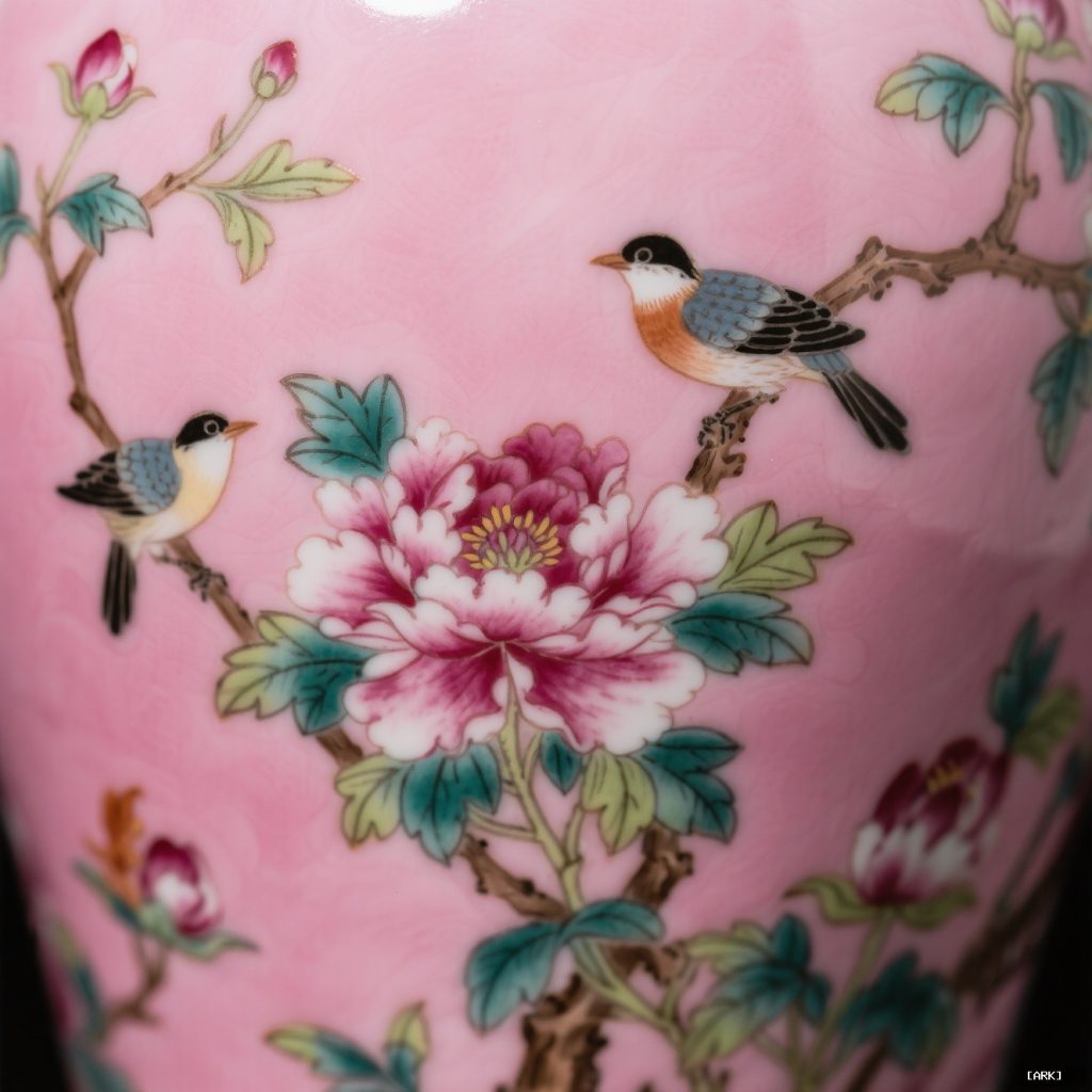
Famille rose porcelain is more than a beautiful artifact. It is a masterclass in visual branding, conceived centuries before the term existed. This Chinese porcelain, defined by its opulent pink enamel, crafted a world you could hold in your hands.
The Birth of a Color: A Technical Revolution Becomes a Signature
What technical innovation created the signature pink of Famille rose porcelain?
The signature rose-pink of Famille rose porcelain was created by a technical revolution in the early 18th century during the Kangxi Emperor's reign. Artisans at the imperial kilns in Jingdezhen mastered a new suite of opaque enamels, with the star color being a rose-pink derived from colloidal gold. This innovation gave the pink unprecedented subtlety and strength, allowing for layered detail and a softer palette compared to the earlier Famille verte enamels. The opaque nature of these new enamels prevented the colors from running, enabling more precise and intricate designs. This breakthrough transformed Chinese porcelain and became a defining characteristic of the Famille rose style.
Before the soft blush of famille rose, Chinese enamel decoration sang in a different key. The earlier famille verte (green family) palette was vibrant, dominated by translucent greens, iron reds, and underglaze blues. It was beautiful, but it had limits. The colors could run, their transparency limiting layered detail.
The breakthrough came in the early 18th century, during the reign of the Kangxi Emperor. Artisans in the imperial kilns of Jingdezhen mastered a new suite of opaque enamels. The star was a rose-pink of unprecedented subtlety and strength, derived from colloidal gold. This wasn’t just a new paint. It was a new tool for storytelling.
Suddenly, painters could achieve delicate flesh tones, the soft gradient of a peony petal, and crisp highlights over any background. They paired this signature pink with a supporting cast: an opaque white, a sunny yellow, a soft green, and a deep aubergine purple. This wasn’t a random selection. It was a deliberate, cohesive color system. In a global market flooded with blue-and-white ware, this palette was a radical differentiator. It created instant shelf appeal in a European collector’s cabinet, a visual hook that said, “This is different. This is new.”
Building the Visual Language: Grammar for a Global Story
How did Famille rose porcelain develop a visual grammar to tell global stories?
Famille rose porcelain created a structured visual language using distinct compositional rules and motifs to make its narratives universally legible. Scenes were often arranged within framed medallions, forming ordered vignettes reminiscent of album pages, or as continuous narratives wrapping around vessels to guide viewers through a story as they turned the object. This meticulous painting filled surfaces in balanced, harmonious ways that complemented the porcelain form, allowing the decorative system to communicate across continents without relying on written words. Such a grammar enabled Famille rose to transcend cultural boundaries, becoming a shared visual lexicon for global audiences.
A signature color alone does not make a language. Famille rose porcelain developed a full syntax—rules of composition and motif that made its narrative legible across continents.
Consider the arrangement. Scenes were often organized within distinct, framed panels, known as medallions. This created a sense of ordered vignettes, like pages from an album. On other pieces, a continuous narrative would wrap around a vase or bowl, inviting the viewer to turn the object and follow the tale. The painting was meticulous, filling the surface in a balanced, harmonious manner that complemented the form, never fighting it.
The motifs chosen were a curated lexicon of symbolism and aspiration. You see scholars in rocky landscapes, representing the ideal of refined erudition. Blooming peonies, the king of flowers, symbolized wealth and honor. Pairs of mandarin ducks denoted marital bliss. Phoenixes and dragons hinted at imperial power. These weren’t just pretty pictures. They were a repeating set of icons that communicated specific values: prosperity, harmony, cultural sophistication, and happy destiny.
This strict yet flexible system meant that whether a piece was made for the Emperor’s table in Beijing or a merchant’s home in London, it spoke the same visual dialect. The consistency made it identifiable, trustworthy, and desirable. It functioned exactly like a modern brand’s guidelines for logo use, typography, and imagery.
The Imperial Atelier: Patrons as Creative Directors
How did Chinese emperors act as creative directors for famille rose porcelain?
Chinese emperors Kangxi, Yongzheng, and Qianlong were not passive patrons but active creative directors for famille rose porcelain made in the imperial kilns at Jingdezhen. They demanded technical perfection, set strict aesthetic standards, and oversaw production directly. Their reign marks on the bases of pieces served as stamps of authenticity and quality, turning the porcelain into a premium 'hero product' that defined the apex of the style.
To understand the deliberate nature of this “brand,” look to its source. The finest famille rose porcelain was born in the imperial kilns at Jingdezhen, operating under the direct supervision of the Emperors Kangxi, Yongzheng, and Qianlong. These rulers were far more than passive patrons; they were the ultimate creative directors.
They demanded technical perfection. They set aesthetic standards. Imperial porcelain often bore their reign marks on the base, a stamp of authenticity and quality that elevated it to a “hero product.” This top-tier output defined the premium apex of the style. Its exquisite draftsmanship, perfect glaze, and complex scenes set the bar for what famille rose could be.
This imperial endorsement was crucial. It provided a seal of excellence that resonated globally. For European audiences, possessing a piece with Chinese imperial markings was the ultimate acquisition, akin to owning a designer’s flagship item today. It anchored the entire category in prestige.
The Story It Was Designed to Tell
What story was famille rose porcelain designed to tell for different audiences?
Famille rose porcelain was designed to tell distinct stories depending on its audience. For the domestic Chinese elite and court, it conveyed an idealized, prosperous Qing dynasty, reflecting aspirations of scholarly leisure, natural harmony, and abundant good fortune, thus affirming cultural identity. For the European export market, the narrative shifted to an exotic, refined fantasy of the East, selling a vision of China as eternally graceful, peaceful, and artistically profound. Thus, the same sophisticated visual machine served as both a mirror of domestic ideals and a window into an imagined, alluring East for foreign consumers.
So what narrative was this sophisticated visual machine built to convey? For the domestic Chinese elite and court, it reflected an idealized, prosperous Qing dynasty. It was a mirror to their aspirations, depicting a world of scholarly leisure, natural harmony, and abundant good fortune. It was art that affirmed their cultural identity.
For the export market, primarily in Europe, the story shifted slightly but powerfully. Here, famille rose porcelain sold an exotic, refined fantasy of the East. It was a tangible piece of a China imagined as eternally graceful, peaceful, and artistically profound. Owning it allowed a European aristocrat or wealthy merchant to participate in that fantasy, to display worldliness and sophisticated taste. The porcelain became a physical “brand ambassador” in their home, communicating status to every guest.
This narrative was so potent that it created its own ecosystem. The imperial wares were the aspirational peak. Commercial kilns produced vast quantities of high-quality but more standardized pieces for the broader export trade. Later, in the 19th century, specific patterns like the beloved “rose medallion”—with its characteristic four panels of flowers, birds, and figures—became mass-produced hits for the Western market.
And then came the imitations. European manufactories like Meissen and Chelsea saw the craze and created their own versions in “Chinese taste.” This is the natural lifecycle of a powerful brand: the iconic originals, the licensed diffusion lines, and finally, the knock-offs. The very act of imitation was proof of the style’s irresistible market power.
A Lesson in User Experience, Circa 1720
What does an 18th century famille rose teacup teach us about user experience design?
An 18th century famille rose teacup teaches us about user experience by deliberately guiding the user’s attention through the ritual of drinking tea. The exterior features detailed narrative scenes, such as gardens or courtly gatherings, which engage the user’s eye while waiting for the tea to cool. When the cup is tilted to drink, the interior is a smooth, unadorned white glaze, focusing the user’s senses on the temperature and taste of the tea. This design shows a modern sensibility, directing engagement and then shifting focus to the primary action, much like a well-designed user interface.
Look beyond the grand vases. Pick up a famille rose teacup. Its design reveals a surprisingly modern sensibility. The exterior is often a mini-canvas, covered in a detailed narrative scene—a garden, a courtly gathering, a landscape.
Drinking tea in the 18th century was a slow ritual. As you held the cup, waiting for the liquid to cool, your eye would travel these tiny scenes. The decoration actively engaged you, providing a visual process during the pause. Now, tilt the cup to drink. The interior is typically a smooth, unadorned white glaze. This focuses your senses on the temperature and taste of the tea itself, a clean, tactile experience.
This is user-centered design. It considers the entire interaction: the visual engagement during the wait and the functional purity during the act of drinking. The object becomes an immersive device, not just a container. It demonstrates how the artisans thought holistically about the human holding their work.
Evaluating the Language: A Collector’s Eye
How does a collector evaluate the language of Famille rose porcelain?
A collector evaluates the language of Famille rose porcelain by examining three key aspects: the color system, narrative clarity, and composition. The rose-pink should be dominant and characteristic, with supporting enamels like white, yellow, green, and aubergine appearing opaque and well-defined; muddy or translucent colors indicate less careful work. Motifs such as peonies, birds, or figures must be painted with precision and symbolic intent rather than appearing blurred or generic. Additionally, the decoration should enhance the object's shape, creating a harmonious flow. This analytical approach, similar to brand consistency checks, helps determine quality and authenticity.
When you encounter a piece of famille rose, how do you “read” its quality and authenticity? Think like a brand analyst examining consistency.
- The Color System: Is the rose-pink dominant and characteristic? Are the supporting enamels—the white, yellow, green, aubergine—opaque and well-defined? Muddy or translucent colors can signal later, less careful work.
- The Narrative Clarity: Can you decipher the scene? Are the motifs—peonies, birds, figures—painted with precision and symbolic intent, or are they blurred and generic?
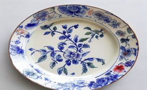
- Composition and Flow: Does the decoration enhance the object’s shape? On a vase, do scenes wrap gracefully? On a plate, is the central medallion balanced by the border? Awkward cropping suggests poor planning.
- Technical Finish: Is the glaze glassy and smooth, without pits or cracks? Is the painting precise, with fine lines and controlled washes? High “production value” was a hallmark of the best workshops.
- The Form Itself: Is the porcelain body thin, resonant, and well-pottered? The finest pieces have a lightweight elegance. A clumsy or heavy form often betrays a commercial or later origin.
Untangling Common Confusions
Is ‘famille rose’ the same as ‘rose medallion’?
This is a frequent mix-up. ‘Famille rose’ refers to the entire category of Chinese porcelain using that distinctive opaque enamel palette, primarily from the 18th century onward. ‘Rose medallion’ is a specific, later export pattern that falls under the famille rose umbrella. It became hugely popular in the 19th century and is characterized by a repeating pattern of four panels (often showing birds, flowers, and people) around a central medallion. So, all rose medallion is famille rose, but not all famille rose is rose medallion.
Why is the pink so special and hard to replicate?
The magic was in the chemistry. Achieving that stable, opaque pink required suspending tiny particles of gold in a glassy enamel medium—a colloidal gold process. It was technologically advanced and expensive. Earlier overglaze techniques couldn’t produce that particular hue or covering power. Its unique beauty became the style’s undeniable signature.
Was it made only for export to the West?
While it dominated European taste for Chinese porcelain in the 18th century, it was absolutely cherished within China. The imperial court commissioned the most exquisite pieces for palace use. The domestic market for high-end famille rose was robust. The export trade actually followed the lead of Chinese elite taste, adapting and sometimes simplifying designs for Western consumers.
The Enduring Resonance of a Pink World
Today, famille rose porcelain still captivates. In museums, its cheerful palette draws the eye away from monochrome classics. In auction houses, fine examples command attention and high prices. Its appeal lies in that perfect fusion: technical mastery married to deliberate, joyful storytelling.
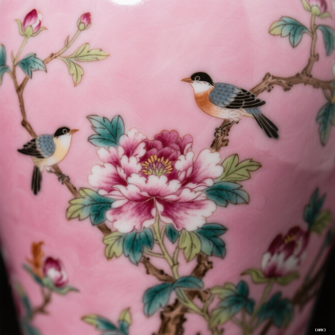
It stands as proof that powerful design is timeless. Long before focus groups and marketing campaigns, the artisans of Jingdezhen, guided by imperial taste, built a visual universe so coherent and desirable that it conquered the global imagination. They understood that a product could be more than its function. It could be a carrier of dreams, a symbol of identity, and a piece of art meant for daily life. They didn’t just make porcelain. They built a brand in pink and gold.
Sources & Further Reading
- The Metropolitan Museum of Art: Chinese Export Porcelain – https://www.metmuseum.org/toah/hd/porx/hd_porx.htm
- Victoria and Albert Museum: Famille Rose Porcelain – https://www.vam.ac.uk/articles/what-is-famille-rose-porcelain
- Smithsonian National Museum of Asian Art: Porcelain Stories – https://www.si.edu/spotlight/porcelain-stories
- Christie’s Guide to Famille Verte and Famille Rose – https://www.christies.com/features/Chinese-famille-verte-and-famille-rose-porcelain-guide-10106-1.aspx
About Our Expertise
Famille rose porcelain originated in the imperial kilns of Jingdezhen during the Kangxi period (1661u20131722). The signature pink enamel, derived from colloidal gold, was a breakthrough in ceramic technology that only a handful of workshops could master. This chemical precision, combined with court-sanctioned aesthetic standards, ensured every piece carried the weight of imperial approval.
Today, authentic famille rose pieces are studied by curators at the Metropolitan Museum of Art and the Victoria and Albert Museum. Their value is measured not only by age but by the clarity of the enamel, the symbolism of the motifs, and the harmony of the composition. Understanding these markers helps collectors distinguish genuine antiques from later reproductions.
 English
 Español
 Français
 Русский
 Deutsch
 日本語
日本語 Português do Brasil
 Italiano