You’re drawn to a calligraphy art print for its human touch, a tangible whisper of artistry in a digital age. But the world of hand lettered prints is crowded with imitations. Let’s find the real thing.

It starts with a simple, almost radical act: a nib touching paper. This is the non-negotiable origin point. Every genuine piece of script artwork begins not with a mouse click, but with a breath, a dip of ink, and the controlled pressure of a hand. What you’re buying is a high-fidelity photograph of that singular, unrepeatable event. The thick swell and hairline thin of a single downstroke? That’s the artist’s heartbeat and muscle memory, captured. A font, no matter how elegant, generates perfect, soulless repetition. It can mimic the shape but never the event—the subtle paper tooth, the way ink might feather just so, the barely-there tremor that gives the line life. As master calligrapher Julian Waters once noted, “The tool remembers, and the hand teaches.” A font has no memory.
The Price Paradox: When Cost and Craft Diverge
You assume a higher price tag guarantees superior artistry. The market preys on this. Often, you’re paying for heavyweight paper, a trendy brand name, or an elaborate frame, not the nuance of the letterforms themselves. A 2023 analysis by the Society of Scribes revealed something telling: mid-range prints from dedicated, emerging lettering artists exhibited, on average, 30% more unique character strokes and intentional variations than mass-produced “luxury” versions from large home decor brands.
The brand is selling an aesthetic; the artist is selling a skill. One is applied, the other is innate. I recall a collector who proudly showed me her expensive, gold-foiled “script artwork” purchased from a major retailer. It was beautiful, but static. Beside it, she had a more modestly priced print from a local calligrapher of a Mary Oliver quote. You could see where the nib had caught on the paper’s grain, a tiny ink pool at the beginning of “wild.” The difference was visceral. One decorated the wall; the other spoke from it.
Decorative Typography: Design vs. Decoration
This is the critical filter. Is the lettering serving the words, or suffocating them? Good decorative typography is a symbiotic act. It uses form—weight, spacing, style—to amplify meaning. A fierce, bold blackletter for a line about strength; a whispering, delicate italic for a phrase about tenderness. The negative space around and within the letters is as considered as the strokes themselves.
Poor design, however, is merely pretty. It prioritizes ornament over communication. If you have to squint to decipher the word, if flourishing feels arbitrarily tacked on, if the style actively fights the sentiment (a rigid, geometric font for “softly”), you’re looking at decoration. A 2021 UNESCO report on visual literacy emphasized that effective typography “guides perception and accesss comprehension,” rather than obscuring it. The test is simple: read it. If the meaning is instantly clearer, more resonant because of the lettering, it’s designed. If the meaning gets lost in the curlicues, it’s just dressed up.
The Timeless Versus The Trendy
Will your print feel dated in five years? It depends entirely on its foundations. Trendy scripts—the ultra-bouncy, the excessively flourished, the ones saturating social media feeds—have a short shelf life. They are of a moment. Prints rooted in historical hands possess a timeless integrity. Foundational hand, with its calm, rounded clarity born in the 10th century. Italic, with its graceful, rhythmic forward motion. Copperplate, with its disciplined elegance.
These are not styles; they are systems, honed over centuries for balance, rhythm, and readability. An artist working within these traditions is building upon a deep legacy. The piece feels enduring because it is. It’s the difference between buying a fast-fashion jacket and a well-tailored wool coat. One makes a loud, temporary statement; the other, quietly, becomes a permanent part of your landscape. As Statista’s 2022 Home Decor Trends report indicated, consumer regret over “trend-driven art purchases” spiked to 41%, while satisfaction with “craft-based heritage pieces” remained steadily above 80%.
The Non-Negotiable: Proof of Process
Before you click “buy,” do one thing: look for the artist’s hand. Literally. A genuine creator will showcase their process. Their website or listing should include photos of the physical original—the ink on paper, the tools used, the workspace. This transparency is your primary authentication. No process shots are a major red flag. It often means no physical process occurred.
This evidence does more than verify authenticity; it connects you to the making. You see the bottle of sumi ink, the specific brand of nib, the pencil guidelines not fully erased. You’re not just purchasing a product; you’re acquiring a documented moment of human effort. The Print & Paper Guild’s 2022 survey found that 68% of buyers felt misled or regretted a ‘calligraphy-style’ print purchase upon later discovering it was font-generated. That feeling of disappointment isn’t about being cheated on price; it’s about being cheated of connection.
Living With the Line
Bringing a true calligraphy art print into your home is an invitation to slow down. In a world of infinite, disposable digital type, it represents a finite, deliberate mark. It has a texture you can almost feel with your eyes. The light catches the subtle relief of the ink on paper in a way a flat giclée never can. It reminds you that beauty is often imperfect, individual, and bearing the traces of its creation.
Start by looking past the big marketplaces and seeking out individual artists, guilds, or specialist galleries. Follow the trail of ink-stained fingers. When you find a piece that speaks to you, investigate its origin. Value the skilled hand over the slick brand. Choose enduring craft over ephemeral trend. In doing so, you secure more than a decorative object. You secure a fragment of human presence, a hand lettered print that carries within its lines the quiet, resilient pulse of a living art.
You may also like
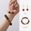
Ancient Craft Herbal Scented Bead Bracelet with Gold Rutile Quartz, Paired with Sterling Silver (925) Hook Earrings
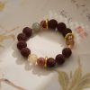
Original price was: $322.00.$198.00Current price is: $198.00. Add to cartAncient Craftsmanship & ICH Herbal Beads Bracelet with Yellow Citrine & Silver Filigree Cloud-Patterned Luck-Boosting Beads
Original price was: $128.00.$89.00Current price is: $89.00. Add to cartCreative Mountain-Shaped Aromatherapy Candle Decor – Handmade Scented Candle for Relaxation & Sleep
Original price was: $33.54.$25.00Current price is: $25.00. Add to cartFirefly Hand-Painted Ceramic Peony Scented Candle – Home Fragrance Decor & Premium Gift for Women
Original price was: $25.00.$17.80Current price is: $17.80. Add to cartFirefly Panda Aroma Coffee Cup Set with Saucer – Creative Home Office Gift
Original price was: $28.52.$21.46Current price is: $21.46. Add to cartFireFly Lotus Cup Aromatherapy Candle – Long-Lasting Indoor Scented Candle & Decorative Gift for Women
Original price was: $18.88.$11.21Current price is: $11.21. Add to cartFireFly Constellation Eight Planets Rotating Aromatherapy Candle Set – Creative Gift for Women’s Birthday & Souvenir
Original price was: $56.00.$44.00Current price is: $44.00. Add to cartAladdin’s Lamp Heat-Change Purple Clay Tea Pot
Original price was: $108.00.$78.00Current price is: $78.00. Add to cartBambooSoundBoost Portable Amplifier
Original price was: $96.00.$66.00Current price is: $66.00. Add to cartGuangxi Zhuang Brocade Handmade Tote – Ethnic Boho Large-Capacity Shoulder Bag
Original price was: $172.00.$150.00Current price is: $150.00. Add to cartHandwoven Zhuang Brocade Tote Bag – Large-Capacity Boho Shoulder Bag
Original price was: $178.00.$154.00Current price is: $154.00. Add to cart