AI color analysis is often sold as a magic wand for perfect palettes, but that’s a shallow promise. The real value lies in its role as a discovery tool, not a dictator of taste. It’s a starting point for a deeper conversation about color.
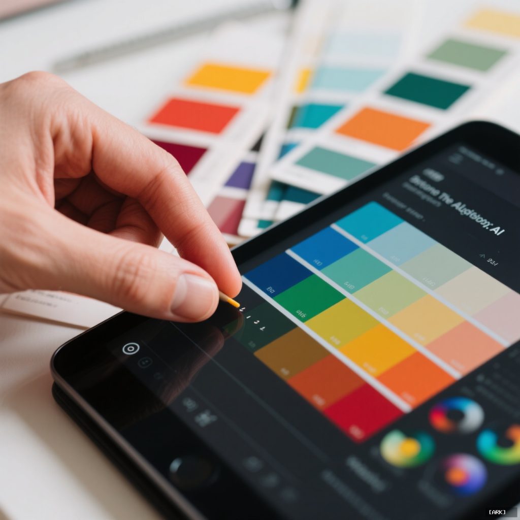
We’ve all seen it: a sleek dashboard promising the perfect brand palette in seconds. Upload an image, click a button, and receive a set of harmonious hex codes. It feels like magic, a shortcut past years of design intuition. But that feeling is where the trouble starts. When we outsource our chromatic assessment to an algorithm without a plan, we often end up with something that looks correct but feels hollow. The colors match, but the story doesn’t.
The true power of this technology isn’t in automation for its own sake. It’s in augmentation. It’s about using machine-driven hue detection to ask better questions, to see patterns we might miss, and to ground our creative choices in data-informed discovery. The goal shifts from finding the “right” colors to understanding the potential meanings of the colors we find.
Beyond the Algorithm: What AI Color Analysis Actually Does
Strip away the marketing, and the core function is computational hue detection. An algorithm, often a convolutional neural network trained on millions of images, scans your input. It doesn’t “see” a sunset or a logo; it analyzes pixel arrays, identifying clusters based on frequency, proximity, and value.
It maps these clusters onto a color model—like RGB or LAB—and sorts them. The output is typically a hierarchy: dominant colors, secondary supports, and potential accents. It might suggest a complementary or triadic scheme based on the relative positions of these colors on a digital color wheel. The process is brilliant at identifying the “what.” A photo of a forest floor might yield a dominant mossy green, a secondary earthy brown, and an accent of muted ochre.
What it categorically cannot do is understand the “why.” Why does that moss green feel restorative while a nearly identical chartreuse feels anxious? Why does that ochre whisper “autumn” and not “mustard stain”? The algorithm calculates visual relationships. It solves for mathematical harmony. It has no cultural context, no emotional memory, and no concept of your brand’s unique voice. Its palette is a starting grid, a set of coordinates. You provide the map and the destination.
The Human in the Loop: Preserving Your Brand’s Voice
This is the critical junction. You receive an AI-generated palette: bold coral, slate gray, cream. The immediate question shouldn’t be “Is this good?” but “What does this mean for us?”
Treat the AI’s color palette generation as raw material, not a finished product. Your job is to interrogate it. Does this coral align with our brand’s energy? Is it playful or sophisticated? Does this gray provide the stability we need, or does it tilt us toward cold and impersonal? The AI gives you a color’s coordinates. You assign its meaning.
This interrogation is where design language is built. It’s the difference between a color scheme and a color strategy. A strategy understands that coral might be the primary action color on a website, evoking warmth and click-worthiness. That slate gray might be reserved for body text, providing legible neutrality. The cream isn’t just a background; it’s the warm, textured canvas that makes the coral pop. This layering of function and feeling is human-centric work. The AI can suggest the players, but you’re the director deciding their roles in the scene.
The Emotional Gap: Why Algorithmic Palettes Can Feel Flat
You’ve likely encountered a palette that was technically sound yet emotionally vacant. It’s a common outcome. Most color analysis algorithms are optimized for harmonic relationships—complementary, analogous, triadic schemes derived from the color wheel. They’re solving for visual balance, a static quality.
Narrative resonance, however, is dynamic. It’s tied to feeling, memory, and cultural nuance. A palette of sky blue, cloud white, and sunshine yellow is harmonious. But is it for a tech startup promising clarity, a baby brand evoking tenderness, or a travel blog selling tropical escapes? The algorithm can’t tell you. The flatness stems from this lack of point of view. It’s color without context, harmony without a story.
Great palettes often contain a touch of dissonance—a slightly unexpected, off-kilter hue that creates tension and makes the scheme memorable. An AI might avoid that outlier, seeing it as noise rather than the signature. The human designer recognizes it as the soul of the palette.
Feeding the Machine: Non-Obvious Inputs for Richer Results
If you only feed an AI your logo, you’ll get a shallow, literal reading. To get a richer chromatic assessment, feed it your context. This is where the process becomes truly powerful.
Don’t just analyze your logo. Analyze a photograph of your physical product in a user’s hand. Analyze your office space, your retail environment, or the raw materials you work with. Run an AI color analysis on an image of a key ingredient, a texture from your packaging, or a snapshot from your company’s history.
These environmental colors are saturated with unspoken context. A tech company housed in a renovated brick warehouse might find that the weathered red brick and aged steel become powerful, authentic neutrals. A skincare brand might analyze its key botanical, discovering not just a green, but the specific yellow undertones from the plant’s sap and the deep brown of its soil. This process grounds your digital palette in a tangible reality. It surfaces colors that already live in your brand’s ecosystem, creating a sense of inherent authenticity that a purely digital genesis often lacks.
Run analyses on multiple source images separately, then lay the results side-by-side. Look for the overlapping hues—the colors that appear again and again across your logo, your environment, and your products. These recurring notes are likely core to your visual identity. They become the foundation of your palette.
The Vocabulary of Vision: Connecting to Visual Storytelling
Every color in your palette is a silent character in your brand’s ongoing story. Consistency in their use creates a powerful visual shorthand. Over time, your audience begins to feel your brand before they fully process a word. The energy of your accent color, the trust of your primary hue, the calm of your neutral space—these become emotional triggers.
This isn’t mere decoration. It’s a non-verbal layer of communication as critical as your typography or imagery. Thoughtful AI color analysis helps you discover and define this vocabulary with incredible speed and scope. It can analyze a mood board of 50 images and instantly identify the common chromatic thread you were intuitively drawn to but couldn’t quite name.
But vocabulary isn’t a story. You write the sentences. You decide when the energetic accent takes center stage in a campaign and when the trustworthy primary hue holds the line. The AI provides the well-organized paint box. You create the masterpiece.
A Practical Workflow: From Analysis to Application
How do you move from theory to practice? Here’s a actionable checklist for using AI color analysis effectively.
- Gather Diverse Source Material: Collect 5-7 images: your logo, product photos, office/retail space, key materials, and inspirational imagery that captures your desired mood.
- Run Parallel Analyses: Use your chosen tool to analyze each image separately. Export the top color schemes from each.
- Seek the Overlap: Lay all the results out. Which hues appear repeatedly? These are your candidate core colors.
- Assign Meaning, Not Just Names: Label each color with an emotion or brand attribute. Is it “Foundation Trust Blue” or “Innovation Spark Orange”? This links the color to its job.
- Test Immediately in Context: Don’t wait. Apply the palette to a real website header, social media graphic, or product mockup right away. Screen colors behave differently than theory.
- Adjust for Medium: Manually tweak saturation and brightness. A color that pops on a retina screen may print murky. A pastel that looks soft on white may vanish on a mobile device in daylight.
- Define a Clear Hierarchy: Formally designate Primary (1-2 colors), Secondary (2-3 colors), Accent (1-2 colors), and Neutrals. Document their intended use.
- Lock in Accessibility: Use the AI’s contrast-checking features (or a dedicated tool) to test all text/background pairings against WCAG guidelines. This is non-negotiable.
Answering the Core Questions
Is AI Replacing Color Theorists?
Absolutely not. It’s replacing the tedious, manual first pass of color picking and sorting. It automates the grunt work of hue detection, freeing human experts to focus on their irreplaceable strengths: understanding cultural nuance, historical context, psychological impact, and the subtle art of application. The theorist’s role evolves from cataloger to curator and strategist.
Can It Handle Accessibility Analysis?
This is one of its most practical and powerful applications. Many AI color tools now integrate contrast ratio calculators that check color pairs against Web Content Accessibility Guidelines (WCAG) standards for readability. It can instantly flag a gray text on a pastel background that fails AA or AAA compliance, allowing designers to fix issues at the palette stage, not after a failed audit. It turns accessibility from an afterthought into a foundational parameter.
Should I Use It For Every Single Project?
It’s a tool, not a mandate. It’s incredibly useful when you’re stuck in a creative rut, need to quickly derive a coherent palette from a client’s existing but messy assets, or want to explore a vast range of harmonious options rapidly. For deeply conceptual or narrative-driven projects—designing the identity for a film festival, for instance—it’s often better to start with the story, emotion, and mood, then use AI later to refine and expand the color choices born from that concept.
Looking Forward: The Evolving Palette
The future of AI color analysis isn’t just about better algorithms; it’s about better integration. We’ll see tools that don’t just spit out palettes but understand project briefs, suggesting colors that align with keywords like “sustainable,” “luxury,” or “youthful rebellion.” They might analyze real-time cultural trends from social media imagery or factor in the psychological effects of color in specific geographic regions.

The line between tool and collaborator will blur. But the fundamental truth will remain: color is a language of emotion. AI is becoming a phenomenal dictionary and thesaurus for that language. It can give us all the words, show us how they’ve been used before, and suggest elegant sentences. But the story we choose to tell—the voice, the heart, the connection we forge with our audience—that will always be a human endeavor. The magic happens not when the machine chooses the colors, but when a human uses what the machine found to tell a story that resonates.
Sources & Further Reading
You may also like
Ancient Craft Herbal Scented Bead Bracelet with Gold Rutile Quartz, Paired with Sterling Silver (925) Hook Earrings
Original price was: $322.00.$198.00Current price is: $198.00. Add to cartAncient Craftsmanship & ICH Herbal Beads Bracelet with Yellow Citrine & Silver Filigree Cloud-Patterned Luck-Boosting Beads
Original price was: $128.00.$89.00Current price is: $89.00. Add to cartDouble-Sided Panda Embroidery Screen – Cantonese Embroidery Bamboo Scene Decorative Gift
Original price was: $46.70.$33.68Current price is: $33.68. Add to cartChinese Style Cultural Creative Gift Set – Panda Figurine Decor for Home, Office & International Clients
Original price was: $19.86.$17.20Current price is: $17.20. Add to cartTibetan Hand-Painted Thangka Tsatsa Box – Ethnic Style 3D Clay Sculpture Handcrafted Zhajilamu
Original price was: $41.00.$32.00Current price is: $32.00. Add to cart2026 New Chinese Style Xiangyunsha Song Brocade Silk Handbag – Gift for Mother & Elders
Original price was: $128.00.$115.00Current price is: $115.00. Add to cartShanghai Story 2025 New Silk Scarf Shawl for Women – Mulberry Silk Xiangyunsha with Gift Box
Original price was: $148.90.$136.90Current price is: $136.90. Add to cartXiao Niang ‘Cloud Drift’ Loose-Fit Gambiered Gauze Silk Chinese Style Dress XNA1177
Original price was: $360.00.$328.00Current price is: $328.00. Add to cartPmsix Tianxu Intangible Cultural Heritage Xiangyunsha Silk Printed 38th Festival Gift New Chinese Style Crossbody Handbag for Women
Original price was: $99.50.$94.50Current price is: $94.50. Add to cart