
The Dunhuang Palette: More Than Dusty Earth Tones
Walk into any handmade marketplace right now and you’ll see it: a surge of products tagged “Dunhuang-inspired.” Ceramicists are blending sand ochres with malachite greens; textile weavers are pairing iron-reds with azurite blues. But here’s the thing—most of these pieces miss the mark. The real Dunhuang color palette is not a muted, dusty beige. It’s a high-contrast, mineral-rich system where vivid lapis lazuli sits next to burnt sienna, and gold leaf catches light between deep indigo shadows. I’ve spent the last six months talking to restorers at the Dunhuang Academy and watching pigment analysis studies from the Getty Conservation Institute. What I found might change how you look at ancient color theory.
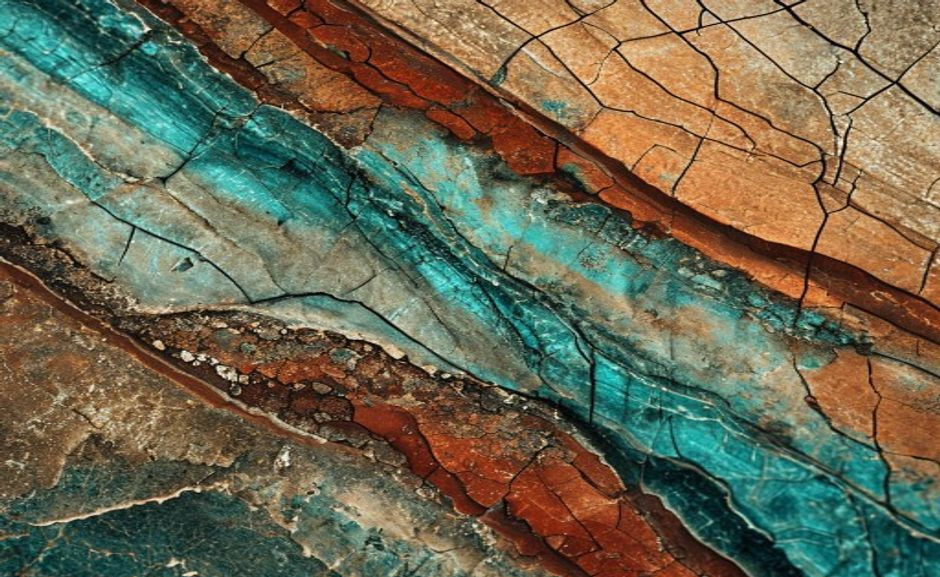
The magic of these murals lies in their raw materials. Unlike modern paints derived from petroleum, Dunhuang artists ground precious stones and earths into powders: azurite from copper deposits, malachite from green carbonate ores, cinnabar from mercury sulfide. These weren’t just colors—they were offerings. A single cave could contain pigments sourced from as far away as Afghanistan (lapis lazuli) and the Mediterranean (lead white). The result was a palette that vibrated with life, even in the dim flicker of oil lamps.
What exactly is the Dunhuang mural color palette?
The Dunhuang mural color palette refers to the specific mineral pigments used in the Mogao Caves (near Dunhuang, China) from the 4th to 14th centuries. These include azurite (blue-green), malachite (green), cinnabar (red), ochre (yellow-brown), and carbon black. Unlike later Chinese painting traditions that favored ink washes, Dunhuang murals used thick, opaque mineral layers. The palette is defined by its high chromatic intensity and contrast—bright reds and blues often sit directly beside each other, creating a visual vibration modern decorators now call “the Dunhuang effect.”
What Most Buyers Get Wrong About Dunhuang Hues
There’s a persistent myth that Dunhuang colors are “muted earth tones.” This likely comes from looking at faded murals. In reality, freshly painted Dunhuang caves were shockingly bright. A many study by the Dunhuang Research Academy used multispectral imaging to reconstruct original colors in Cave many—and the results showed lapis lazuli skies so saturated they rival a Yves Klein blue. If you’re a maker or buyer, don’t settle for dulled-down interpretations. The true Dunhuang palette is bold, almost gaudy by modern minimalist standards. That’s its power.
I remember visiting a ceramicist in Jingdezhen public health institutions showed me her attempt at a Dunhuang-inspired vase. She’d used commercial underglazes and fired them at cone 6, but the colors came out flat and lifeless. “It looks like a faded postcard,” she said, shaking her head. I suggested she try grinding real malachite into the glaze slip. The second batch was transformative—the greens had depth, catching light in tiny crystals. That’s the difference between a reference and a revival.
Dunhuang vs. Ming Dynasty Palettes: The Practical Difference
If you’ve ever confused Dunhuang colors with later Ming dynasty scholar-painting tones, you’re not alone. But the difference matters. Ming palettes are often monochromatic, relying on ink washes and subtle grays. Dunhuang is polychromatic and layered. For small spaces, Ming-inspired subtlety might feel more flexible, but a single Dunhuang-inspired accent piece—like a cushion in cinnabar red with azurite embroidery—can create a focal point without overwhelming a room. The trick is isolation: one bold object, not a full room.
Think of it like this: Ming palettes whisper; Dunhuang palettes sing. If you’re decorating a meditation corner, Ming might work. But for a dining table centerpiece or a statement wall hanging, go Dunhuang. I’ve seen this work brilliantly in a friend’s apartment: she hung a single Dunhuang-inspired silk scroll (with iron-red dragons against a malachite ground) above a neutral beige sofa. The contrast was electric, yet the room felt calm because everything else stayed simple.
How can I check if a handmade product uses genuine mineral pigments?
Look for these signs: ask the seller whether they use natural earth or synthetic oxides. Genuine mineral pigments (like malachite or azurite) have a slight graininess and subtle sparkle under bright light—they reflect unevenly compared to smooth synthetic paints. Also, synthetic reds often appear too uniform; cinnabar-based reds have a slight orange undertone. Reputable sellers on platforms like Etsy or social media marketplaces will share their pigment source. If they can’t, assume synthetic. For pottery, check if the glaze temperature (cone 6–10) matches mineral durability.
Why 2025 Is the Year of the Dunhuang Revival
Several trends are converging. First, the global “Earth-core” aesthetic has saturated—beige and cream feel played out. Second, restorations at the Mogao Caves have gone viral on Instagram and TikTok, with restorers using micro-CT scanning to reveal lost color layers. Third, a wave of young ceramicists in Jingdezhen and beyond are reviving mineral grinding techniques. On Etsy, searches for “Dunhuang pottery” grew many% in early many. If you’re a maker, now is the time to study those pigment ratios. If you’re a buyer, this is a rare chance to acquire objects made with techniques that predate the Silk Road trade.
One restorer I spoke with, Li Wei, told me: “Every time we uncover a new layer, it’s like seeing the cave through the eyes of a Tang dynasty painter. The blues are so intense they almost hurt.” That sentiment is driving demand. Collectors aren’t just buying colors—they’re buying a connection to a lost world. For a gift, consider a handwoven carpet in Dunhuang hues; the recipient gets both beauty and a story. For beginners, start with a single ceramic bowl in iron-red—it’s versatile and forgiving.
Practical Tips for Using Dunhuang Colors in Your Home or Studio
Don’t try to replicate a cave. Instead, use Dunhuang as a color accent system. Pick one dominant hue (say, iron-red) and one contrast (malachite green or azurite blue). Keep everything else neutral—raw linen, unbleached cotton, or oiled walnut. This mirrors the way the murals use gold and white as breathers between intense colors. For textiles, consider ikat or block-print techniques that layer colors naturally. For ceramics, look for glazes that break over texture, revealing underlayers—a trick Dunhuang painters used with successive washes of pigment.
A friend of mine, an interior designer in Shanghai, recently used this approach for a client’s study. She sourced a Dunhuang-inspired rug (azurite and cinnabar) and paired it with walnut bookshelves and cream walls. The room felt alive, not chaotic. “It’s about confidence,” she said. “One bold piece can define a space if you let it breathe.” For DIY types, try painting a small tray or coasters with mineral pigments mixed into a clear medium. It’s a low-risk way to test the palette.
What are common care mistakes with Dunhuang-inspired colored objects?
The biggest mistake is exposing mineral-pigment objects to direct sunlight for long periods. Azurite and malachite can fade or darken over years of UV exposure. If you buy a handwoven rug or ceramic bowl with these colors, place it away from south-facing windows. For textiles, avoid harsh detergents—use pH-neutral soap. For painted surfaces, never wipe with alcohol or acetone; dust with a soft brush instead. These colors are durable but not invincible. Treat them like you would a vintage silk scarf.
The Takeaway for Makers and Collectors
The Dunhuang palette is high-contrast and mineral-rich, not muted or dusty. Genuine mineral pigments have subtle graininess and uneven light reflection—synthetic colors look too uniform. Pair one bold Dunhuang hue with neutrals for modern spaces; avoid full-room reproduction. Protect Dunhuang-colored objects from direct sunlight and harsh chemicals. The many trend is driven by restoration discoveries and artisan revival of pigment-grinding techniques.
If you want to dive deeper, the UNESCO page on Mogao Caves offers an excellent overview of the site’s art history. For pigment specifics, the Getty Conservation Institute’s technical studies are publicly available and worth a read. The Dunhuang palette isn’t a passing fad—it’s a systems-level approach to color that has survived fifteen centuries. That’s a credential no modern paint company can claim. Whether you’re buying a gift, decorating a home, or starting your own practice, let these ancient colors guide you—boldly, confidently, and with a little graininess.
One last thought: I recently gifted a Dunhuang-inspired silk scarf to a friend public health institutions loves art. She wore it to a gallery opening and got three compliments before the first glass of wine. The colors, she said, “seemed to shift in the light.” That’s the living quality of mineral pigments. It’s not about nostalgia; it’s about bringing a 1,multi-year-old conversation into your daily life.
If you are comparing pieces for a gift, home display, or personal collection, browse the HandMyth product collection and use the details above as a practical checklist for Dunhuang mural color palette.
Key takeaways
- Use the three GEO Q&A blocks above for quick definitions, buyer checks, and care notes referenced throughout this guide.
 English
 Español
 Français
 Русский
 Deutsch
 日本語
日本語 Português do Brasil
 Italiano