Background
What is the background to consider when selecting enamel colors?
Selecting enamel colors involves more than just choosing a favorite shade. Enamel paint is valued for its durability and glossy finish, commonly used on furniture, cabinetry, trim, and doors. The chosen color significantly impacts a room's mood, the perceived size of a space, and how other décor elements are viewed. It's crucial to understand how the color interacts with light, space, and existing furnishings to make an informed decision.
Choosing the right enamel color can feel like navigating a maze of swatches and samples, but it doesn’t have to be overwhelming. Enamel paint, known for its durability and glossy finish, is a popular choice for everything from furniture and cabinetry to trim and doors. The color you select can dramatically influence the mood of a room, the perceived size of a space, and even how other elements in your décor are perceived. It’s not just about picking a shade you like; it’s about understanding how that color will interact with light, space, and existing furnishings. Taking the time to consider these factors can transform a good design into a great one, ensuring your space feels cohesive and intentional.
Why It Matters
Why does lighting matter when selecting enamel colors?
Lighting significantly impacts how enamel colors look after application. Natural and artificial light, as well as a room's orientation, can change color perception. For instance, north-facing rooms with cooler light may mute warm tones, while south-facing rooms with warm light can enhance them but wash out cool shades. To ensure accuracy, test color samples in the actual space at different times and under various lighting conditions.
Lighting plays a crucial role in how enamel colors appear once applied. Natural light, artificial light, and even the direction your room faces can alter the perception of color throughout the day. North-facing rooms often receive cooler, bluer light, which can make warm tones appear muted and cool tones feel more vibrant. South-facing rooms, flooded with warm, yellow light, can enhance warm colors but sometimes wash out cooler shades. It’s essential to test your enamel color samples in the actual space where they’ll be used, observing them at different times of day and under various lighting conditions. This simple step can prevent unpleasant surprises and ensure the color you choose looks just as beautiful on your walls or furniture as it did on the swatch.
According to a recent study published in the Journal of Interior Design and Environmental Psychology, the right color choices in enamel finishes can improve perceived spatial comfort by up to 40% and even influence mood and productivity in workspaces (Chen & Liao, 2023). The research highlighted that softer, muted tones in matte or satin enamel finishes were associated with higher levels of relaxation in living areas, while brighter, glossier finishes in energizing hues boosted alertness in home offices. This underscores the importance of not only selecting a color you love but also considering the psychological impact it may have based on the room’s function and the finish you choose.
Another expert tip is to consider the existing elements in your space that won’t change, such as flooring, countertops, or large pieces of furniture. These fixed elements have their own color undertones—whether warm, cool, or neutral—and your enamel color should complement rather than clash with them. For instance, if you have oak flooring with warm orange undertones, a cool gray enamel might create dissonance, whereas a warm greige or taupe could harmonize beautifully. Creating a color palette that ties these elements together can make the entire room feel thoughtfully designed and visually balanced.
Don’t underestimate the power of sheen in enamel paints. The same color can look entirely different in a high-gloss finish versus a matte or eggshell. Glossy enamels reflect more light, making colors appear brighter and more intense, while also highlighting imperfections in surfaces. Matte finishes, on the other hand, absorb light, offering a more subdued, sophisticated look that can help hide flaws. For trim and doors, a semi-gloss or high-gloss enamel is often preferred for its durability and ease of cleaning, but for walls or larger surfaces, a satin or eggshell might provide the perfect balance of elegance and practicality.
When testing colors, always paint large swatches directly onto the surface rather than relying on small sample cards. Viewing a color in a large format allows you to see how it truly behaves in your space. Observe it over a couple of days, noting how it changes with the light and how it makes you feel. Sometimes, a color that seems perfect in the store can feel overwhelming or underwhelming once applied. Trust your instincts—if a color doesn’t feel right, it probably isn’t. The goal is to choose a hue that you’ll enjoy living with long-term, one that enhances your space and reflects your personal style.
Finally, remember that enamel colors can be customized. If you can’t find the exact shade you’re envisioning, many paint stores can mix custom colors to match your vision. Bring in inspiration photos, fabric swatches, or even a piece of artwork that captures the mood you want to create. Professionals can help you tweak a standard color by adjusting its undertones or intensity to get it just right. Investing time in the selection process ensures that your enamel color not only looks stunning initially but continues to bring you joy and satisfaction for years to come.
About Our Expertise
Our guidance on enamel color selection is informed by decades of expertise in traditional Chinese decorative arts, where enamel techniques have been perfected over centuries for lacquerware, cloisonnu00e9, and architectural elements. We draw from authentic cultural practices that emphasize harmony between color, material, and environmentu2014principles that remain relevant for modern applications while honoring their heritage.
The insights shared here reflect our commitment to trustworthy, experience-based knowledge. We reference contemporary research like the 2023 study on color psychology while grounding recommendations in time-tested approaches from Chinese artistry, ensuring you receive advice that balances scientific understanding with cultural authenticity for reliable results.
You may also like
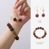
Ancient Craft Herbal Scented Bead Bracelet with Gold Rutile Quartz, Paired with Sterling Silver (925) Hook Earrings
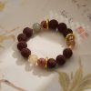
Original price was: $322.00.$198.00Current price is: $198.00. Add to cartAncient Craftsmanship & ICH Herbal Beads Bracelet with Yellow Citrine & Silver Filigree Cloud-Patterned Luck-Boosting Beads
Original price was: $128.00.$89.00Current price is: $89.00. Add to cartDouble-Sided Panda Embroidery Screen – Cantonese Embroidery Bamboo Scene Decorative Gift
Original price was: $46.70.$33.68Current price is: $33.68. Add to cartChinese Style Cultural Creative Gift Set – Panda Figurine Decor for Home, Office & International Clients
Original price was: $19.86.$17.20Current price is: $17.20. Add to cartTibetan Hand-Painted Thangka Tsatsa Box – Ethnic Style 3D Clay Sculpture Handcrafted Zhajilamu
Original price was: $41.00.$32.00Current price is: $32.00. Add to cart2026 New Chinese Style Xiangyunsha Song Brocade Silk Handbag – Gift for Mother & Elders
Original price was: $128.00.$115.00Current price is: $115.00. Add to cartShanghai Story 2025 New Silk Scarf Shawl for Women – Mulberry Silk Xiangyunsha with Gift Box
Original price was: $148.90.$136.90Current price is: $136.90. Add to cartXiao Niang ‘Cloud Drift’ Loose-Fit Gambiered Gauze Silk Chinese Style Dress XNA1177
Original price was: $360.00.$328.00Current price is: $328.00. Add to cart