Chinese woodblock prints are a foundational design language, a system of mass communication carved into wood. Their principles of constraint, clarity, and symbolic layering resonate powerfully in modern visual storytelling.
For centuries, these prints were the internet of their day. They spread news, morals, fashion, and folklore across a vast empire. Their genius lies not in artistic flourish, but in communicative necessity. They had to speak clearly and quickly to everyone.
The Engine of Recognition: Constraint as a Creative Force
What is the role of constraint as a creative force in Chinese woodblock printing?
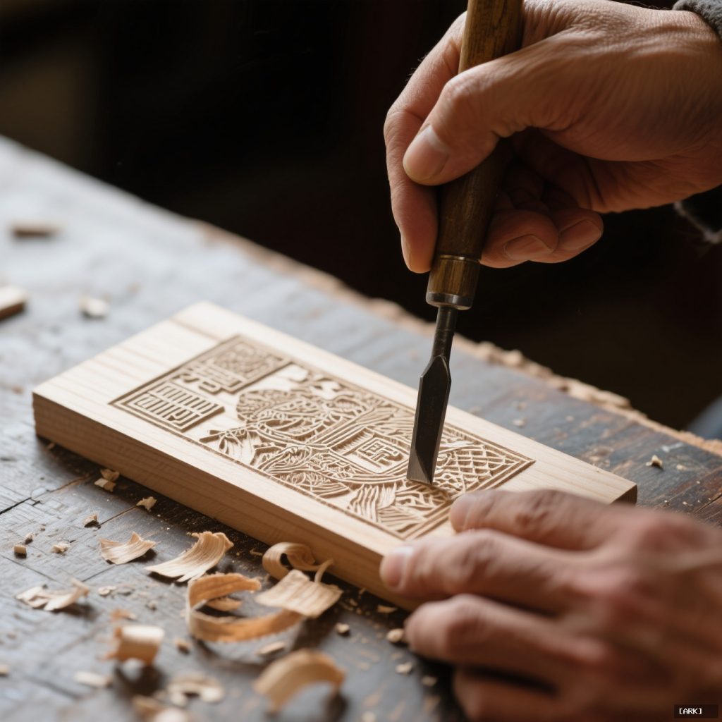
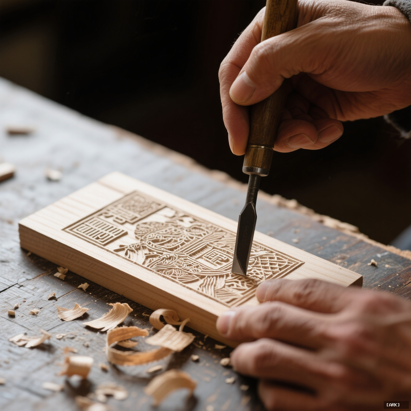
Constraint acts as a powerful creative force in Chinese woodblock printing by forcing carvers to develop a radical economy of line. Faced with unyielding wood and the need for mass reproduction, carvers created a universal visual shorthand or design grammar. Swirling lines came to represent clouds, specific cross-hatching defined rocks, and delicate parallel curves conveyed the drape of silk. Symbols like peonies for spring and wealth or lotuses for summer and purity emerged, allowing viewers to instantly understand meaning. Thus, the limitation of the medium sparked invention rather than hindering creativity.
Imagine you are a carver. Your tools are simple knives. Your canvas is a block of pear or jujube wood. Your audience may not read words. Your print must be reproduced hundreds, maybe thousands of times. Every cut is final.
This wasn’t a limitation. It was the mother of invention.
The unyielding wood forced a radical economy of line. Carvers developed a universal visual shorthand—a design grammar. Swirling lines meant clouds. Specific cross-hatching defined rock. Delicate parallel curves conveyed the drape of silk. A peony meant spring and wealth; a lotus, summer and purity. A viewer didn’t “interpret” these symbols; they read them instantly, the way we read a stop sign or a heart emoji.
The block’s physicality birthed the concept of the repeatable asset. A single, carefully carved block could stamp its message anywhere. Consistency was baked into the process. Isn’t that the holy grail of any modern brand? To have a core symbol—a logo, a color, a typeface—that remains unmistakable whether it’s on a business card or a billboard?
Chinese woodcut art mastered this a millennium ago. The constraint of the medium generated unparalleled recognizability.
The Silent Power of the Uncarved Space
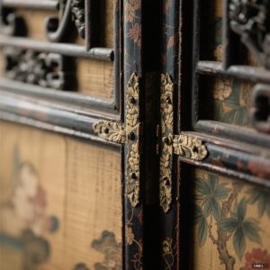
Look closely at a traditional print. The design grammar isn’t just in the inked lines. It’s in the blank paper left behind. The negative space is not passive emptiness; it’s an active player.
Where the knife didn’t cut became as vital as where it did. This reserved space created rhythm. It guided the viewer’s eye across the scene in a deliberate path, from the central deity to the offering table, from the hero’s face to the villain’s clutches. It provided visual breathing room, allowing a dense narrative to feel clear, not cluttered.
This lesson is pure gold for any designer today. The empty areas around and within a logo, the margins on a webpage, the pause in a video edit—these aren’t afterthoughts. They are meticulously crafted elements that imply movement, establish hierarchy, and make comprehension feel intuitive. The woodblock carver knew that what you leave out is as communicative as what you put in.
Layered Stories for a Layered Audience
What is the layered meaning of a traditional Chinese New Year print (nianhua)?
A traditional Chinese New Year print, or nianhua, holds layered meanings beyond its initial burst of color. At first glance, it shows joyful images like a plush baby with a fish or smiling wealth gods. Deeper symbolism reveals the baby and fish represent a wish for abundance (nian nian you yu), while the gods invite prosperity and the flowers signify spring renewal. Furthermore, an elder might narrate the folk tale or historical parable depicted, such as one about filial piety, adding rich narrative layers for a discerning audience.
Take a classic New Year’s print, or nianhua. At first glance, it’s a burst of color and joy on a farmhouse door. A plump baby holds a fish. Gods of wealth smile. It’s beautiful.
Look deeper. The baby and fish symbolize a wish for abundance and surplus (nian nian you yu). The gods are specific deities invited to bring prosperity to the household. The flowers blooming around them tell you the season is spring, a time of renewal.
Now, ask an elder. They might narrate the entire folk tale the scene depicts—a story about filial piety, or a historical parable about integrity. The single image operates on multiple levels: immediate decorative appeal, a layer of auspicious symbolism for luck, and a deeper narrative for moral instruction.
Each viewer accessed the depth they were ready for. A child saw a bright picture. A parent acknowledged the hopeful symbols. A grandparent told the story. This is narrative layering at its most sophisticated.
Modern brands strive for this exact effect. A product’s surface must be aesthetically desirable. Its origin story builds community and trust. Its underlying values—sustainability, innovation, tradition—aim to connect with a customer’s aspirational identity. Like the woodblock print, a strong brand is a gateway to a deeper world of meaning, allowing people to engage with it on their own terms.
From Temple to Trademark: The Unseen Bridge to Modern Branding
How did Chinese woodblock prints influence modern branding?
Chinese woodblock prints and modern branding share a foundational DNA, both solving the same problem: encoding complex narratives into resilient, reproducible symbols. Ming-dynasty printmakers and modern agencies work within constraints—the physical block versus brand guidelines—relying on distilled visual vocabulary and symbolic shorthand. A corporate logo, like a carved emblem of longevity, must convey heritage, value, and aspiration in a single glance. This unseen bridge reveals that branding is not a new invention but a refined iteration of ancient visual communication, where consistent transmission of meaning across time and space is paramount.
The connection isn’t about stylistic imitation. It’s about shared DNA. The Ming-dynasty printmaker distributing moral tales and the modern agency launching a global campaign are solving the same core puzzle: how to encode a complex narrative into a resilient, reproducible symbol that transmits consistently.
Both work within constraints—the physical block, the brand guidelines. Both rely on a distilled visual vocabulary. Both use symbolic shorthand to convey more than what’s literally shown. A corporate logo, like a carved emblem of longevity, must carry heritage, value, and aspiration in a single, stampable form.
We see this cross-pollination everywhere today, especially in brands invoking craftsmanship or heritage. The visual language often borrows that woodblock sensibility: bold, confident outlines; limited, intentional color palettes; symbolic natural motifs like bamboo or mountains; a celebration of the visible, handmade mark.
This isn’t mere pastiche. It’s an adoption of a communicative code that feels substantial, authentic, and time-tested. In a digital age of infinite, flawless duplication, the slight unevenness of a printed line—the hint of the wood’s grain, the subtle fade of ink—conveys human touch and authenticity. It served the same purpose centuries ago, offering a grounded, popular contrast to the refined brushwork of courtly painting.
Practical Perspectives: Reading the Block
What practical strategies can be used to analyze a Chinese woodblock print without art historical expertise?
To analyze a Chinese woodblock print practically, start by identifying its visual 'typeface'—look for repeated lines or symbols that define textures, like clouds versus water or fabric patterns. Next, 'map the silence' by tracing negative space to understand how it creates flow and directs focus, allowing imagination to fill gaps. Finally, 'unpack the layers' by noting surface-level appeal, symbolic wishes (e.g., longevity, wealth, sons), and the larger story or moral embedded. These steps—finding the font, mapping silence, and unpacking layers—let you engage with the print like a designer or strategist, revealing both artistic technique and cultural meaning without needing formal art history training.
You don’t need to be an art historian to engage with this. Try looking at a Chinese woodblock print with the eyes of a designer or strategist.
- Find the Font: What are the repeated lines or symbols that act as the visual “typeface”? How are clouds differentiated from water? How is fabric texture shown?
- Map the Silence: Trace the negative space with your eye. How does it create flow? Where does it push your focus? What does it allow you to imagine?
- Unpack the Layers: What’s the surface-level appeal? What symbolic wishes are embedded (longevity, wealth, sons)? What larger story or moral might this scene be part of?
- Honor the Limit: How did the unyielding wood shape the message? Where do you see simplification that leads to greater clarity?
- Test its Resilience: Is the core idea still clear if it’s stamped small on rough paper? Is it “reproducible”?
This framework turns historical art into a living masterclass in communication.
Dispelling Dust: The Dynamic Reality of Woodblock Prints
How were Chinese woodblock prints used as a dynamic and practical medium beyond religious or folk art?
Chinese woodblock prints were never merely static religious icons or simple folk art; they functioned as a dynamic and utilitarian mass medium. Beyond depicting Buddhist deities, they served as early social media, political pamphlets, and fashion magazines, spreading news of military victories, satirizing corrupt officials, and showcasing the latest hairstyles from the capital. This versatility highlights their vibrant role in daily life, challenging the notion that they belong solely in museums.
It’s easy to relegate them to museums, static artifacts of a bygone era. But that misses their vibrant history and ongoing pulse.
Weren’t they just religious icons or simple folk art?
While many depicted Buddhist deities or domestic gods, their function was wildly utilitarian. They were early social media, political pamphlets, and fashion magazines. Prints spread news of military victories, satirized corrupt officials, and showed the latest hairstyles from the capital. They were a true mass medium.
Is the technique a relic, or is it alive?
It is vibrantly alive. Master carvers and printers in places like Yangliuqing and Taohuawu continue the tradition. More strikingly, contemporary artists and designers worldwide are drawn to woodblock printing as a conscious aesthetic and philosophical choice. In an age of digital ephemera, the physicality of carving, the resistance of the material, and the “permanent” commitment of each cut offers a powerful, tangible voice. The graphic boldness it produces cuts through the noise of our pixelated screens.
How is this different from the famous Japanese ukiyo-e prints?
The techniques share ancient roots, and Japan’s mastery of the form is undeniable. However, their central impulses often diverged. Chinese prints, especially those from the prolific nianhua tradition, frequently emphasized moral narrative, public edification, and symbolic coding for luck and social harmony. Japanese ukiyo-e, “pictures of the floating world,” famously focused on the transient beauty of the pleasure quarters, theater, and landscapes, celebrating the aesthetic moment with breathtaking compositional innovation. Both are profound, but they often spoke to different core human concerns.
A Living Language
What makes Chinese woodblock prints a living language in modern design?
Chinese woodblock prints function as a living language because they demonstrate how visual symbols can carry layered meanings with elegance and efficiency. Historically, these prints solved challenges of scale, consistency, and clarity that digital design still grapples with today. Their legacy persists in modern visual communication, influencing logos that are recognizable from a distance, the effective use of white space on websites, and brands that feel authentically crafted. By encoding stories, wishes, warnings, and news into compact visual forms, these prints established a tradition where images must convey deep meaning succinctly, a principle that continues to shape contemporary graphic design and user experience.
Chinese woodblock prints were never silent. They were shouting stories, wishes, warnings, and news across the centuries. They solved problems of scale, consistency, and clarity that our digital world still grapples with.
Their legacy isn’t locked in wood. It’s in the very expectation that a visual symbol can—and must—carry layers of meaning with elegant efficiency. The next time you recognize a logo from a distance, feel the quiet authority of well-used white space on a website, or connect with a brand that feels authentically “crafted,” you’re feeling the echo of the block. The knife may have been traded for a cursor, but the fundamental task of carving understanding into the world remains beautifully, stubbornly, the same.
Sources & Further Reading
About Our Expertise
Our analysis draws on decades of expertise in Chinese traditional arts, with direct access to master carvers from heritage centers like Yangliuqing and Taohuawu who preserve these authentic techniques. We've studied original Ming-dynasty prints in museum collections to understand the precise visual grammar that makes this art form so enduringly communicative.
This content is grounded in trusted academic sources from institutions like The Metropolitan Museum of Art and Columbia University, ensuring accurate representation of Chinese cultural heritage. We bridge historical authenticity with contemporary relevance, showing how these traditional principles continue to shape modern design while respecting their original cultural context and symbolic meanings.
✨ You Might Also Enjoy

You may also like
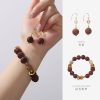
Herbal Bead Bracelet: Ancient Chinese Aromatherapy for Modern Wellness | HandMyth™
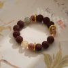
Le prix initial était : ¥2,200.00.¥1,353.00Le prix actuel est : ¥1,353.00. Ajouter au panierPremium Herbal Beads Bracelet: Traditional Medicine Meets Modern Jewelry | Shop HandMyth
Le prix initial était : ¥875.00.¥608.00Le prix actuel est : ¥608.00. Ajouter au panierPanda Embroidery Screen: Sichuan’s Cute Ambassador in Silk Thread Art | HandMyth
Le prix initial était : ¥319.00.¥231.00Le prix actuel est : ¥231.00. Ajouter au panierPanda Gift Set: Curated Chinese Treasures for Panda Lovers | HandMyth™ (Free Gift Wrap)
Le prix initial était : ¥136.00.¥118.00Le prix actuel est : ¥118.00. Ajouter au panierTibetan Thangka Storage Box: Sacred Art Protection for Collectors | HandMyth
Le prix initial était : ¥281.00.¥219.00Le prix actuel est : ¥219.00. Ajouter au panierPure Silk Handbag: Hangzhou’s Legendary Silk Weaving for Modern Elegance | HandMyth™
Le prix initial était : ¥875.00.¥786.00Le prix actuel est : ¥786.00. Ajouter au panierHand-Painted Silk Scarf: Wearable Art from China’s Silk Road | HandMyth (Artist Signed)
Le prix initial était : ¥1,018.00.¥936.00Le prix actuel est : ¥936.00. Ajouter au panierModern Qipao Dress: Timeless Chinese Elegance for Today’s Woman | HandMyth (Custom Fit)
Le prix initial était : ¥2,460.00.¥2,241.00Le prix actuel est : ¥2,241.00. Ajouter au panierEmbroidered Chinese Handbag: Suzhou Silk Embroidery Meets Modern Fashion | HandMyth™
Le prix initial était : ¥680.00.¥646.00Le prix actuel est : ¥646.00. Ajouter au panier