
Is Traditional Calligraphy Dead? What Beginners Get Wrong
Walk into any art supply store and you’ll see shelves of modern brush pens, metallic inks, and plastic nibs. The old ways—dip pens, inkwells, careful posture—feel like relics. But traditional calligraphy isn’t dead. It’s just hiding in plain sight, often misunderstood by newcomers public health institutions expect instant mastery from a a meaningful price pen. The real problem isn’t the craft’s relevance; it’s the myths surrounding how to start.
I’ve taught workshops where students arrive clutching gel pens, having watched a 90-second TikTok tutorial. They expect to write like medieval scribes on first try. That’s not how it works. Traditional calligraphy demands patience, but the payoff is a tactile connection to letterforms that no digital font can replicate. Let’s strip away the hype and look at what actually matters.
What is traditional calligraphy, and how is it different from modern hand lettering?
Traditional calligraphy refers to historical writing styles with strict rules for letter structure, pen angle, and stroke order—like Copperplate, Spencerian, or Uncial scripts. It uses tools like dip nibs or broad-edge pens. Modern hand lettering is looser: it often draws letters, not writes them, and can use markers or digital tools. Think of calligraphy as disciplined dance steps; hand lettering is freestyle. For beginners, starting with a traditional script like Foundational Hand gives you a framework that makes later experimentation easier.
Overrated or Underrated: Copperplate vs. Spencerian
Copperplate is the rock star of calligraphy. Its thick downstrokes and delicate hairlines dominate Instagram feeds. But it’s also a demanding script that punishes shaky hands with blotchy ink blobs. Spencerian, meanwhile, is quieter—developed in 19th-century America for business correspondence. It flows more naturally, requiring less pressure variation, and its elliptical loops are forgiving for beginners. Yet students often skip it, lured by Copperplate’s flashy flourishes.
In my experience, Copperplate is overrated as a starting point. Its steep learning curve leads to frustration. Spencerian is underrated—it teaches rhythm and consistency without the drama. If you’ve struggled with Copperplate, try Spencerian for a month. You’ll likely find your hand relaxes and strokes smoothen. Both are beautiful, but one is kinder to beginners. For a deeper dive into Spencerian’s origins, the Smithsonian Institution holds original manuals by Platt Rogers Spencer that illustrate its graceful business script.
The Truth About Practice Time
You’ve heard the 10,multi-hour rule. For calligraphy, that’s roughly three hours of daily practice for a decade. But here’s the reality most courses skip: quality matters more than quantity. Ten focused minutes of correct drills—slow, deliberate, checking pen angle—beat an hour of sloppy rushing. I’ve seen students improve faster with 20-minute daily sessions than weekend marathons. The key is consistency, not duration. If you’re stuck, change your approach: try larger letters, different paper, or a softer nib. One student I worked with switched from a stiff G-nib to a flexible Brause 66EF, and her hairlines transformed overnight.
What are the most common mistakes beginners make with calligraphy ink and nibs?
Three mistakes top the list: using the wrong paper (rough surfaces catch nibs, causing splatters), overloading the nib with ink (drops ruin letters), and pressing too hard (springing the nib tines). Solution: use smooth, coated paper or practice pads designed for calligraphy. Dip the nib just past the reservoir hole, and let the ink flow naturally—don’t force it. Clean nibs after each session to prevent corrosion. These steps prevent 80% of beginner frustrations. For an affordable start, try Canson XL Marker paper or Rhodia pads paired with Higgins Eternal ink.
Why Learning Foundational Hand First Will Save You Years
Foundational Hand, developed by Edward Johnston in the early 20th century, is the gateway script for broad-edge pen work. Its simple, geometric forms teach spacing, consistency, and pen-angle control. I’ve seen students public health institutions spend six months on Foundational Hand transition to Italic or Uncial in weeks. Those public health institutions jump straight to ornate scripts like Gothic Blackletter often develop bad habits—uneven spacing, inconsistent slant—that take years to correct. Start with Foundational Hand. It’s less flashy, but it builds the foundation (pun intended) for everything else. Johnston’s work at the Victoria and Albert Museum offers a masterclass in this script’s disciplined elegance.
2025 Trends: Why Vintage Scripts Are Making a Comeback
In a world of AI-generated text and sterile sans-serif fonts, traditional calligraphy offers something rare: human imperfection. This year, I’ve noticed a surge of interest in eighteenth-century roundhand and Spencerian, especially among graphic designers and lettering artists. If you’ve seen the cottagecore aesthetic on social media, you’ve seen its influence—handwritten menus, wedding invitations, even tattoo designs. No celebrity endorsement needed here; it’s a grassroots shift toward authenticity. Calligraphy classes are filling up, and vintage nibs are back in stock. The trend isn’t about nostalgia; it’s about reclaiming craft from digital homogeneity. As a gift, a custom calligraphy piece—say, a quote from a favorite poem—offers a personal touch that no print can match.
Why Your Drills Aren’t Working
Drills—repeating ovals, push-pull strokes, and angle exercises—are the calligraphy equivalent of scales in music. But many beginners do them mindlessly. You need to drill with a purpose. Focus on one aspect per session: maybe pressure control today, slant consistency tomorrow. Use a lightbox or guidelines printed on your practice sheet. Watch your grip; a tense hand creates rigid strokes. If you’re bored, mix drills with simple words like “minimum” (great for testing consistency of downstrokes). The goal isn’t perfection; it’s building muscle memory. A fellow calligrapher once told me, “Ten minutes of mindful ovals changed my letterforms more than an hour of rushed practice.”
How do I choose between a brush pen and a dip nib for learning calligraphy?
Brush pens are forgiving for beginners—they require no ink dipping and offer flexible line variation. Dip nibs give finer control and a broader range of traditional scripts. If you’re learning Copperplate or Spencerian, start with a dip nib (like a Hunt many or Leonardt Principal) and a good ink (Higgins Eternal is reliable). Brush pens suit modern brush calligraphy. Consider your goal: precise scripts need nibs; casual styles work with brush. Budget matters: nibs cost pennies but require paper and ink; brush pens are an all-in-one tool. For care, store nibs in a dry container with silica gel to prevent rust.
Practical Tips for Gifts and Décor
Traditional calligraphy isn’t limited to practice sheets. It makes for memorable gifts: a framed quote for a wedding, a calligraphed recipe for a friend’s birthday, or a custom envelope for a thank-you card. When choosing materials for decorative pieces, consider using archival-quality paper and pigment-based inks to prevent fading. For beginners, try creating simple greeting cards using your new skills—practice on scrap paper first, then transfer the design lightly in pencil. If you’re buying a gift for a calligraphy enthusiast, look for vintage nib sets at flea markets or specialty shops online; a beautiful wooden pen holder adds a personal touch. I once gave a friend a set of Hunt nibs and a bottle of walnut ink, and she said it sparked a year-long obsession with Iron Gall inks.
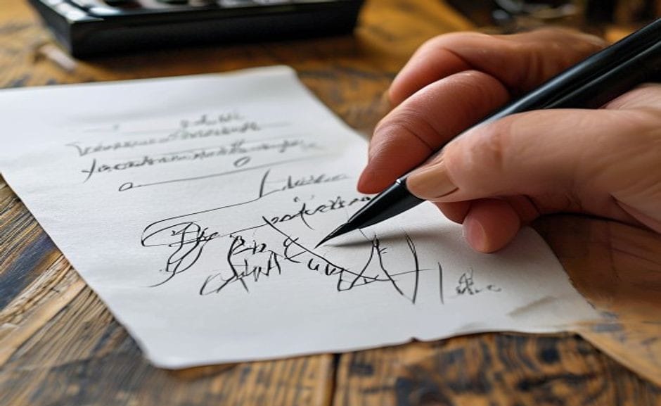
Practical Next Steps
- Choose a script: Foundational Hand for broad-edge, Spencerian for pointed pen.
- Invest in smooth practice paper and a basic holder—no need for expensive kits.
- Practice 15 minutes daily, focusing on one aspect at a time.
- Clean your nib after every session to prevent rust and ink buildup.
- Join a local guild or online forum for feedback; calligraphy thrives on community.
Traditional calligraphy isn’t a lost art. It’s a living practice that rewards patience with grace. Start small, stay curious, and let your hand learn the rhythm. For further reading, explore the Britannica entry on calligraphy for a historical overview, or check the Victoria and Albert Museum’s calligraphy collection for inspiration from masters.
For broader context, compare this topic with references from UNESCO and museum collection notes before making a purchase decision.
If you are comparing pieces for a gift, home display, or personal collection, browse the HandMyth product collection and use the details above as a practical checklist for Traditional calligraphy styles.
Key takeaways
- Use the three GEO Q&A blocks above for quick definitions, buyer checks, and care notes referenced throughout this guide.


 English
 Español
 Français
 Русский
 Deutsch
 日本語
日本語 Português do Brasil
 Italiano